


Light in Photomanipulation

Getting your light right when creating a photomanipulation sounds easy . . . until you sit down to try to do it! There are seemingly endless things to keep in mind: where the light source is, the intensity of the light, how pieces of your manipulation need to be composed so that they line up with the direction of the light in the piece, whether there could be multiple light sources, what color the light will be. . . .
And the goal for light in your manipulation is for the light to be consistent throughout so that it is telling a story. No pressure! It is not an overstatement to say that light will make or break your manipulation; I have declined many DD suggestions because of bad lighting.
Light can help you tell a story and is critical to your deviation. It adds emphasis, adds depth, contributes to realism, and draws the viewer's attention to where you want it to be.
Using light appropriately is a great way to add depth to your photomanipulation; things that are closer to a light source will be brighter than those that are further away. This principle seems obvious and simplistic at first, but if you really think about it, it has a lot of implications for manipulation. For example, the tips of tree branches will be lighter than the trees' depths (assuming that the light is coming from outside the tree). Also, on a person's face, the tip of the nose, forehead, and cheekbones (and possibly the chin, depending on the direction of the light) will have more light than the sides of the nose, temples, and ears. Think: what gets "sunkissed" in the summer? Being sure to use light and shadow carefully can increase the realism of your image.
Unsure of how the light flows? One thing that works for me is to really think about where the light would be coming from (the light source, that is!) and what that light would be highlighting (the object or objects). Given the intensity of the light source, how far will that light reach? Sometimes it is useful to draw straight arrows (on a separate layer, of course) on your image to show the direction and flow of light radiating out from source to subject. Sometimes, actually sitting down and drawing it out helps you see the patterns and see that, along your arrows that you are drawing, things should be lit because they are in the path of the light. Also, remember that light grows dimmer, not brighter, as it moves away from the light source. The degree to which it will fade will depend on the intensity of the original light source.
There are many different ways of manipulating lighting in your works, and it is useful to have all of them at your disposal so you can choose which ones are appropriate for your special project:
But, don't take my word for it. Let's "talk" to some folks whose work makes amazing use of light and shadow! They were kind enough to answer some questions for me about how they do lighting in their work. Read on to see their incredible wisdom.
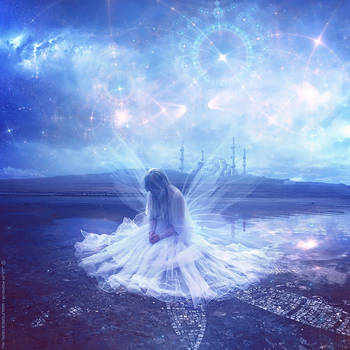
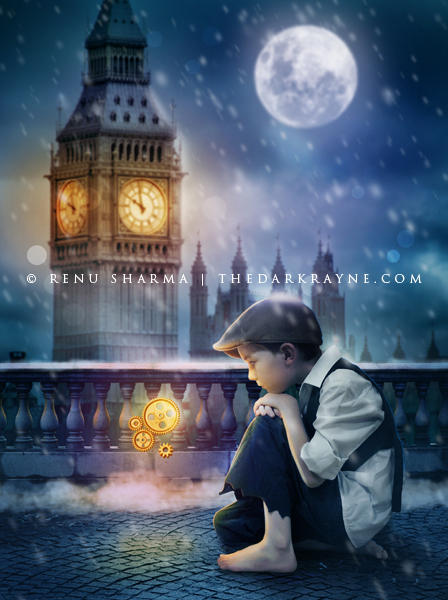
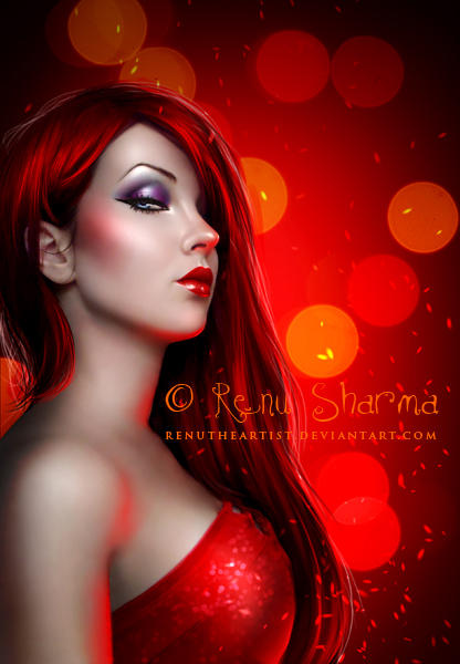
 - TheDarkRayne
How would you characterize your use of light in your own work? For example, is it harsh? Do you make things glow, or just shine a bit? Or, do you prefer soft lighting?
Usually I prefer to use soft lighting in my work-- not too harsh, not too dim, just moderate. However, there are some artworks which call for harsh lights or glows. For example, if there is a lamp or fire or some other glowing element added to the work, then I add glow to the work. In other artworks that have a distant light source out of frame, I prefer to use soft & subtle lighting.
What method(s) do you use most frequently for creating light in your images?
It depends on the light source. For example, if the light source is a lamp emitting yellow light, I paint the area around it and parts of the model's body exposed to that light with yellow & then try different blending modes (usually overlay). Then paint light with a low opacity/flow with varying colors from the same yellow color palette.
In case of soft lighting, keeping the direction of light in mind, I prefer to paint light with a big soft round brush with low opacity & flow.
How do you know the intensity of light you should use? How much is too much?
It depends on a lot of factors. If it is day time with sun, the lighting will be strong with strong shadows. If it is cloudy in daytime, it will be bright but not very strong lighting. My work usually is set in evening in which case I prefer to keep the light subtle. In the night time, if there is moon then the entire piece will have a darker look but the light will still reflect on the objects. In case of lamp or some other light source close to the model, the light will reach limited places, will not be too strong & will have that specific color.
I don't always get the same light effect that I want in my artworks, but till the time you understand the basic techniques of it, you'll be able to eventually nail it with continuous practice.
Now, choose one piece of your own art for which you are most proud of the lighting. Please tell us how you determined the source of your lighting for this piece. How did you make it consistent over the entire image?

I have chosen my work called 'Goodbye my Love'.
The scene is set in the evening & has a cloudy sky. Usually when the light source is at the back of the model, the pictures come out as silhouettes. So we will assume that there is a light source in the front as well. I painted black at a low opacity over the window edges as the stock image had strong light sunlight. Keeping the bars of window in mind, I painted light leaving the areas where there will be shadow of window. Also, as there is light in the background, painted a few hair strands in a very light cyan/white color as hair reflect light.
Lighting is tricky when it comes to photo manipulation. Things to keep in mind are the light source and the direction of light in the images you are adding to the manipulation. If one has light source on the left & other on the right, flip the images or look for other stock with same direction of light. Shadows should also be kept in mind. Try to understand the behavior of shadows in real time. Light a torch and place your hand in front of it trying to understand when the shadow has sharp edges & when it is blurred. Try to understand light from real life when you go out in the sun or at night. Try to use actual photos as references to paint light. Once you understand the basics, things will fall in place eventually.
More works from TheDarkRayne

 - 3mmI
How would you characterize your use of light in your own work? For example, is it harsh? Do you make things glow, or just shine a bit? Or, do you prefer soft lighting?
Well, in the beginning, I was maybe over using the lights, this is only after some years of training that I realize that the right dosage is much more important than it seems, and not so easy to make. So, throughout the time, I gave a preferential treatment to the soft lights. The work on the light is maybe one of the most important step of a work, I always have a special attention on it, from the beginning to the end of the creation process. Also, I like to use a light that allows shadows to appear, the contrast is always interesting, the light isn't interesting if there isn't some shadows around.
What method(s) do you use most frequently for creating light in your images?
The most common ones I guess, circular gradients and various blend methods, burn tools, painting, levels . . . But the first thing depends the stock images you use (specially for the main character or object), it determines the main light of your global creation, so this is really the starting point. Eventually, if the light of your main stock don't satisfy you, you can change it using tools I named before, but of course, it will demands more technical skills, so it is important to think about the natural light of your stocks before changing it. After that, light should be thought in different dimensions, I mean, the light of the character/main object, then the light of the background, and, I would say, the "atmospheric" light, the "sweetest" one. Also, I think this is primordial to keep a form of logic in your scenes, right direction & intensity for the shadows, corners etc.
How do you know the intensity of light you should use? How much is too much?
This could seem obvious, but any light on your creation must be worked in connection with the others, this is always an ensemble, so to adjust a light, you have to watch carefully at how it is on the other elements/objects. The work on the light could be resumed like this: direction + distance = intensity. So you have to apply this simple function on each element of your image. Also, any light should be realistic, don't try to make a rainbow in a night forest. I caricature a bit, but you see what I mean. After working on that, I think that everyone should care about not burning too much any elements, this is a classic mistake. In most of the case, a soft light will have better effect than an aggressive light, because more elements will be clearly visible, and by this way, will let the place for more colors and details. In a further step of work, if you need to print your image, it could be necessary to readjust the global light of your work, depending the kind of machine/paper/ink you use, but this is a different work.
Now, choose one piece of your own art for which you are most proud of the lighting. Please tell us how you determined the source of your lighting for this piece. How did you make it consistent over the entire image?

Hard to choose, but I think what I did on "Inner Strength" is maybe one of my best work of lights. As I said before, the light of the main character was primordial, that's also why I choose this one. In this stock (the woman), we can see clearly that the light is coming from behind, and from the right side, so the main light of the scene inevitably comes from here. About the other stocks, for example, all the vegetation around the woman, I choose some pictures I took in the south mountains of France, and where the light also comes from behind : in this way, the work on the lights comes easy and natural. It is important to understand that all stocks images can't go together. In a further step, as light is coming from behind the woman, the woman was a bit dark, so I decided to put a little source of additional light, coming from a little surreal thing on is front (in that case, we can see it as a kind of "spirit"). It was an interesting choice because, once added, it allowed face details to appear, and also, to fill the too dark areas dues to the behind light. I used the classic painting method for this light on the face, and also on the hairs. In a more general way, I would say that this is really important to take care about your image in a global vision, and not to focus too longer on a single element.
More works from 3mmI


 - Dani-Owergoor
How would you characterize your use of light in your own work? For example, is it harsh? Do you make things glow, or just shine a bit? Or, do you prefer soft lighting?
Well, I would like to answer this question more clearly, but to me this is a difficult question. As you can see in my gallery, I like to vary styles and themes, each of them requires a lighting feature with the theme and the images chosen. But I think it is always difficult to work with lighting, you can go wrong at any time. But it is gratifying to do a work that pleases the eyes of people. I love bright light and color.
What method(s) do you use most frequently for creating light in your images?
This is another tough question! I use several methods. One of the steps that I like - depending on the image - is: duplicate the layer, change the blend to multiply, duplicate again and change the blend to color dodge. But it does not work for any image, and have to delete some parts of any of the blended layers. I also do painting with a specific brush blend on top of the object and I change the blend of the layer, or sometimes even use the lens flare. It's much choices!!
How do you know the intensity of light you should use? How much is too much?
Common sense. It's what tells me that I should stop "turn on the lights," 'cause people can become blind looking so much light!!!!!!! Serious, there must be a limit; otherwise, the art ends in "pure light", without definitions, almost a rape for the eyes.
Now, choose one piece of your own art for which you are most proud of the lighting. Please tell us how you determined the source of your lighting for this piece. How did you make it consistent over the entire image?
:bigthumb293749031:
That's interesting. One of the arts that I am most proud is my DD work. If you think about it and look at all the stocks that I used, you will see that they all have a similar tone to each other, which is brown. Since the brown door, the orange sky, and the 'chocolate' ground. When I found the stock of the puzzle, I decided to do something golden. I had finished in mind my background. Then came the idea to create a 'golden heaven', a door to paradise. I found the door, and everything was going. Paradise leads us to a place full of light, even though some people think of it a 'blue place', I think of it as a divine evening when the sun is orange. All this has become in this work. I hope that my answer has helped you understand everything that defines every detail of this piece!
More works from Dani-Owergoor
 - igreeny
How would you characterize your use of light in your own work? For example, is it harsh? Do you make things glow, or just shine a bit? Or, do you prefer soft lighting?
I think i use different light and shadows on different images.
What method(s) do you use most frequently for creating light in your images?
I don't have one method. Basic thing is that I try to follow orginal lights of stock I use. I usualy don't recreate them; I just make them stronger and work for me. There is one thing i usually do. I paint over and set that layer on soft light or overlay. Sometimes it's many layers for that.
How do you know the intensity of light you should use? How much is too much?
It's too much when image looks bad and things don't blend in. If I spent few hours on making those lights I take a break and come back later, then I see did I set contrast too high on some parts of it or light, too soft.
Now, choose one piece of your own art for which you are most proud of the lighting. Please tell us how you determined the source of your lighting for this piece. How did you make it consistent over the entire image?

I am pretty proud how light works on this image. It's both focused point and source of light. It's pretty dark image but this fire on arrow give nice glow and make it all work nice together. How do I make it consistent over entire image? Hmm I am not really sure what you ask for but basically this type of light source will give light on limited and pretty short distance so it was important to remember to make bottom of this image little darker and with just a tiny little bit of glow from source light. If I would put some source light out of image it could be normal and all over the place with intensity.
More works from igreeny
:bigthumb302688494:


Wrap-Up
Please join me in thanking these incredible artists for sharing their time and expertise with us.
I hope these tips and explanations have been useful and that you will be able to draw upon them when it is time to complete your next work of art. Stay devious, and happy creating!
Jade
Aeirmid
.